NK Osijek is one of Croatia's most prominent football clubs and an important symbol of the city of Osijek. Founded in 1947, the club has played a significant role in Croatian football history while fostering a strong emotional connection with generations of supporters united by the white and blue colours.
Following a change in ownership and the beginning of a new chapter in the club's development, the objective was to redefine the visual identity of NK Osijek and establish a consistent system capable of supporting future growth. The challenge was not to redesign the club's coat of arms, but to preserve its heritage while introducing new graphic elements, standards, and communication tools that would strengthen the relationship between the club, its supporters, and the city itself.
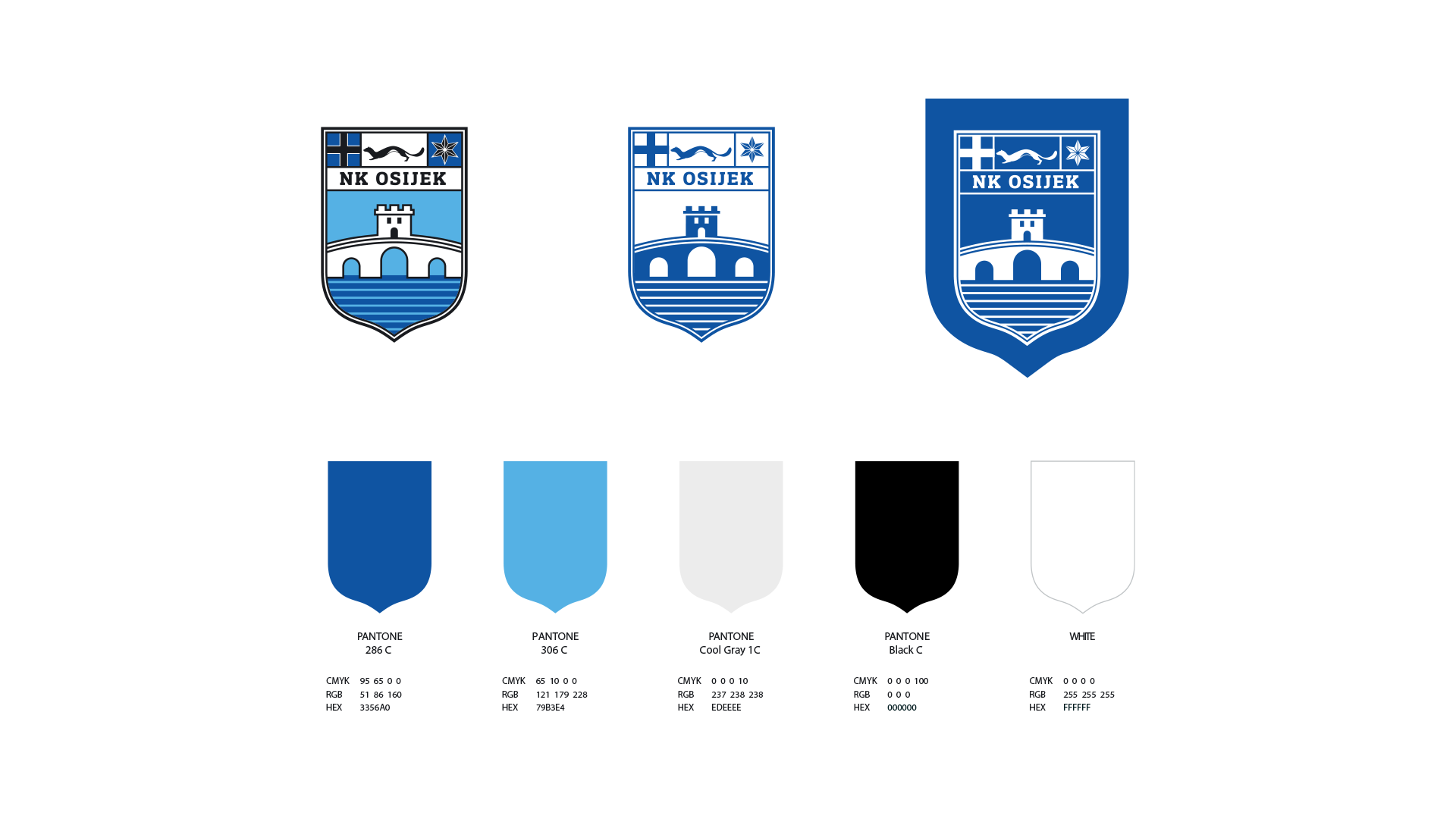
Decades of inconsistent application had resulted in multiple versions of the crest, typography, and colour variations appearing simultaneously. The project therefore required the standardization of the club's identity and the creation of a flexible system suitable for contemporary sports communication.
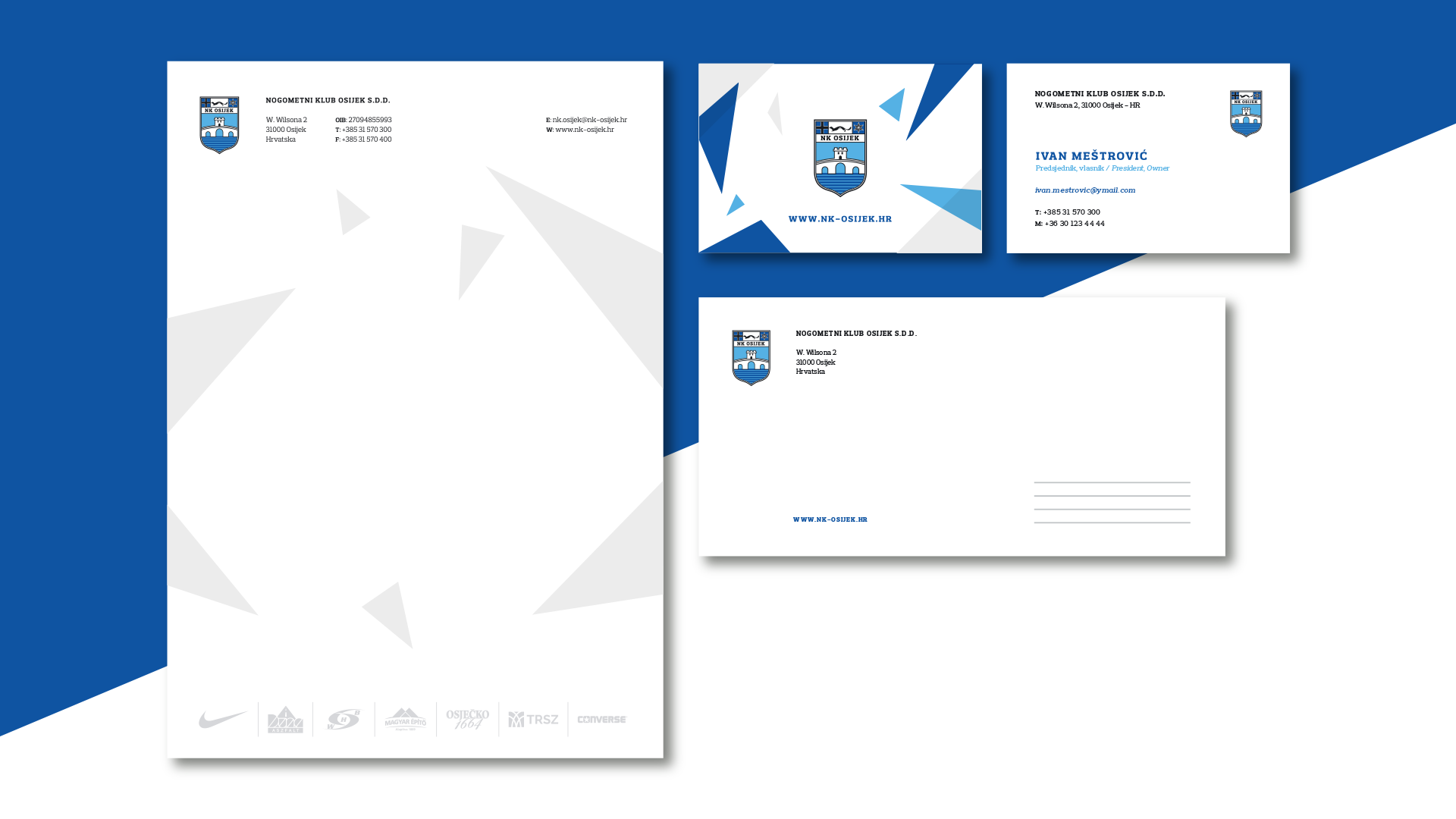
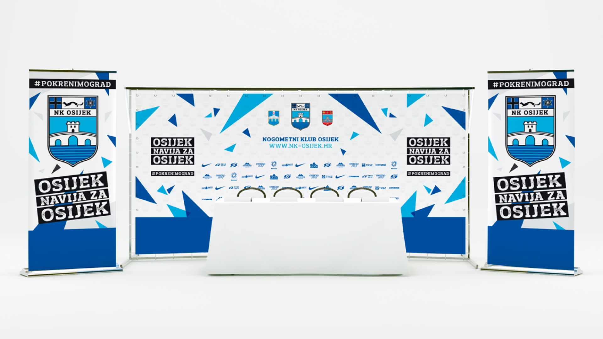
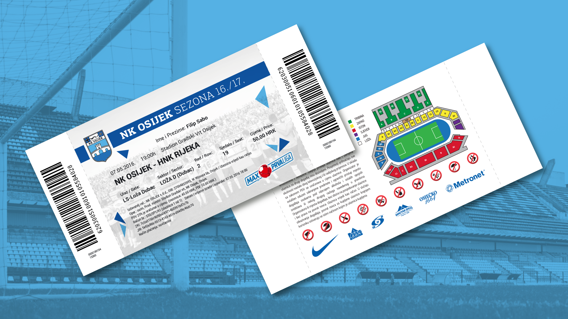
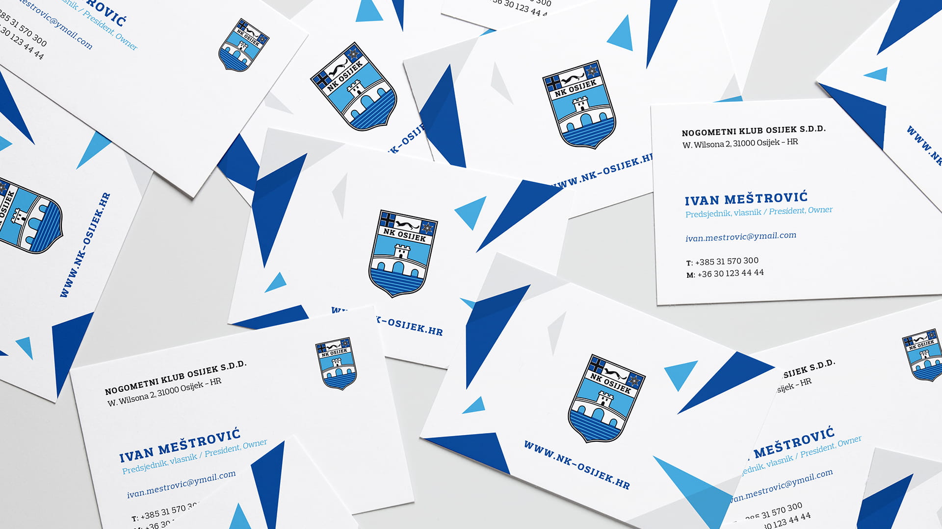
The project began with the development of comprehensive graphic standards that restored consistency across all club communications. The existing crest was refined and standardized, while a new visual language was introduced to extend the identity beyond the emblem itself.
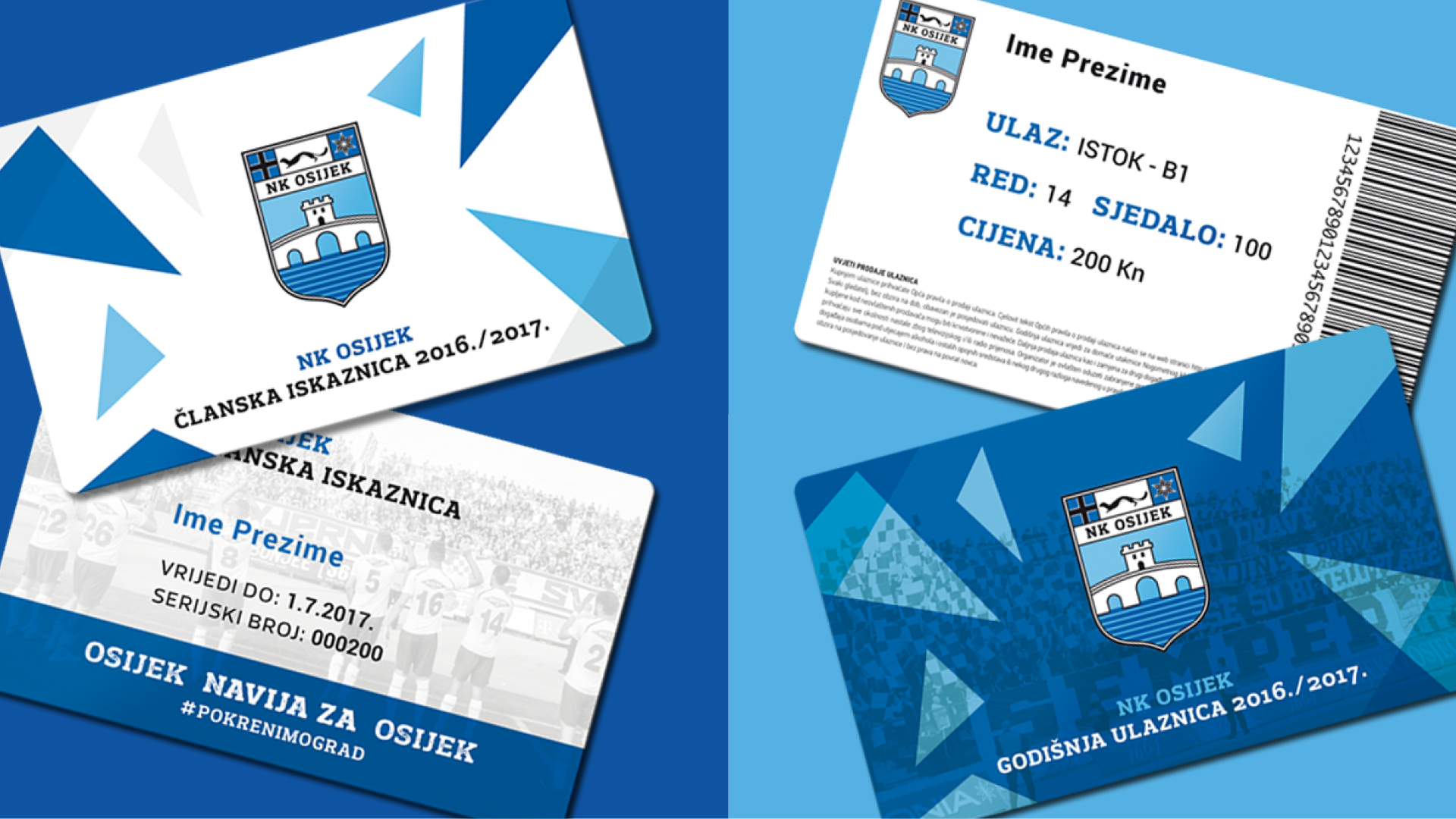
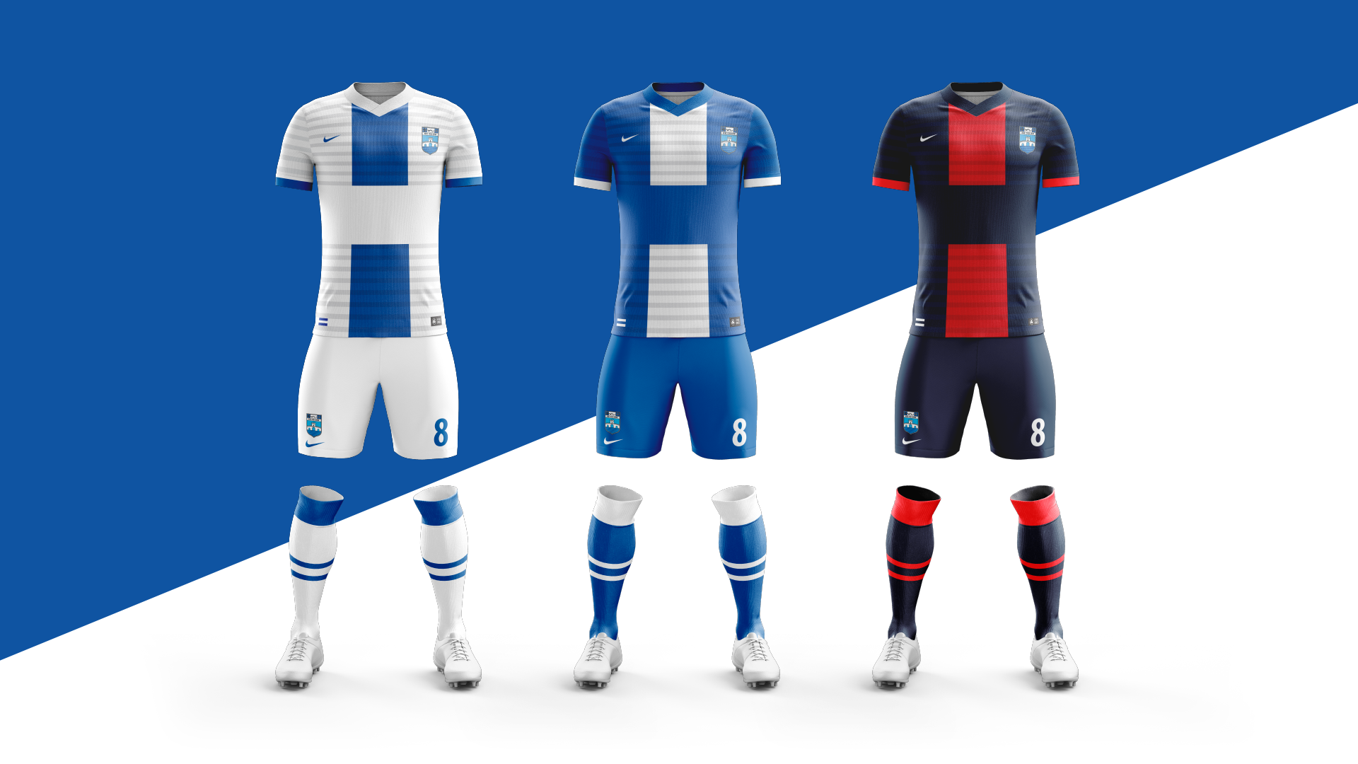
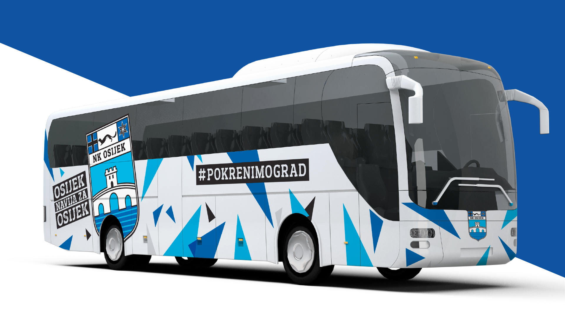
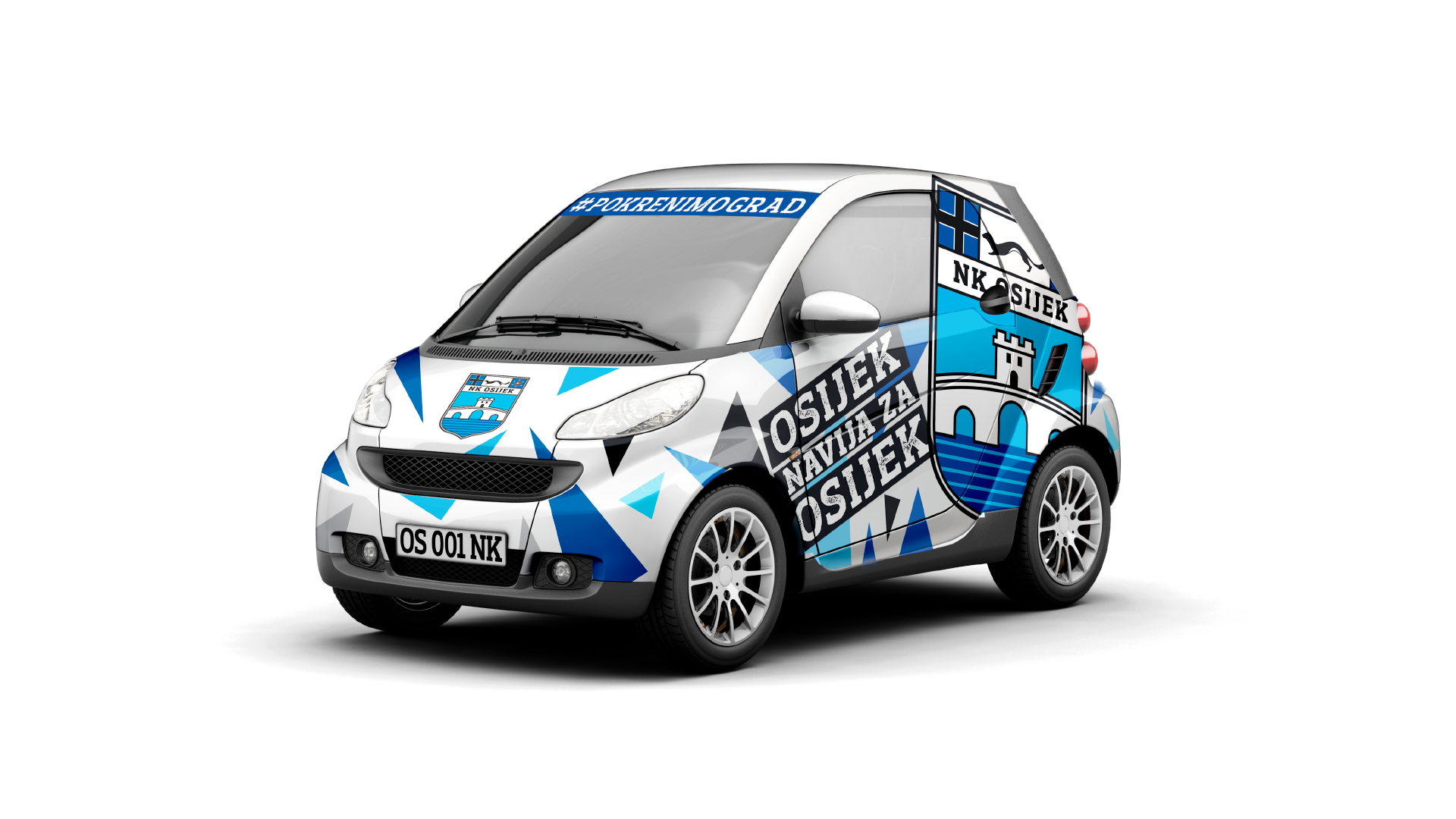
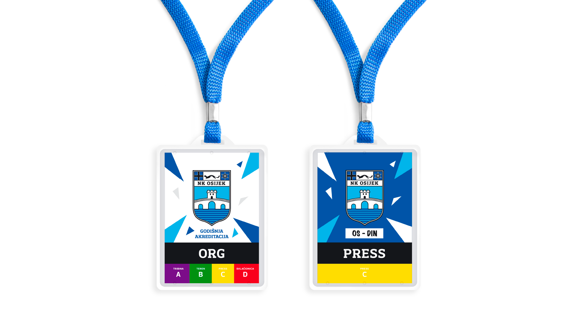
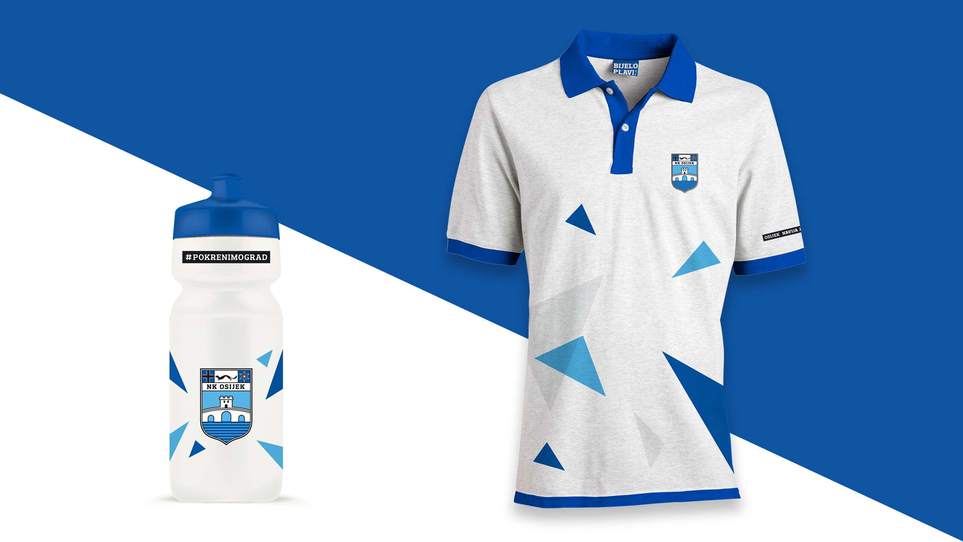
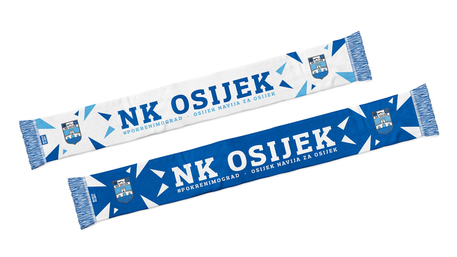
A dynamic system based on triangular elements became the foundation of the new identity. Symbolizing movement, energy, determination, and collective strength, the triangles provided a versatile framework capable of adapting to matchday campaigns, merchandise, digital communication, and environmental branding. The system enabled NK Osijek to establish a distinctive visual presence within Croatian football while creating stronger emotional engagement with supporters.
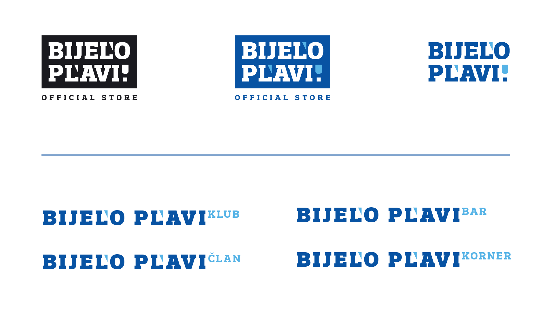
Beyond the identity itself, the project included the development of the club's retail brand architecture through the introduction of Bijelo Plavi, a naming platform inspired by the club's iconic colours. This approach allowed the identity to expand into memberships, merchandise, events, and future initiatives, transforming the rebranding process into a comprehensive communication system for the entire club ecosystem.