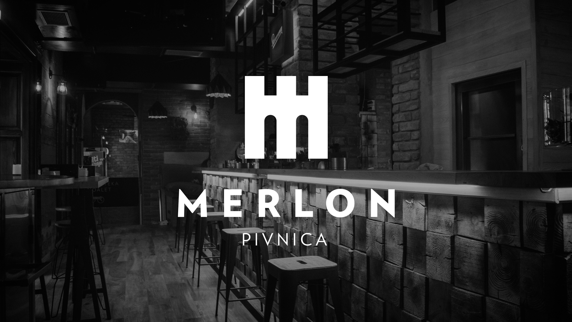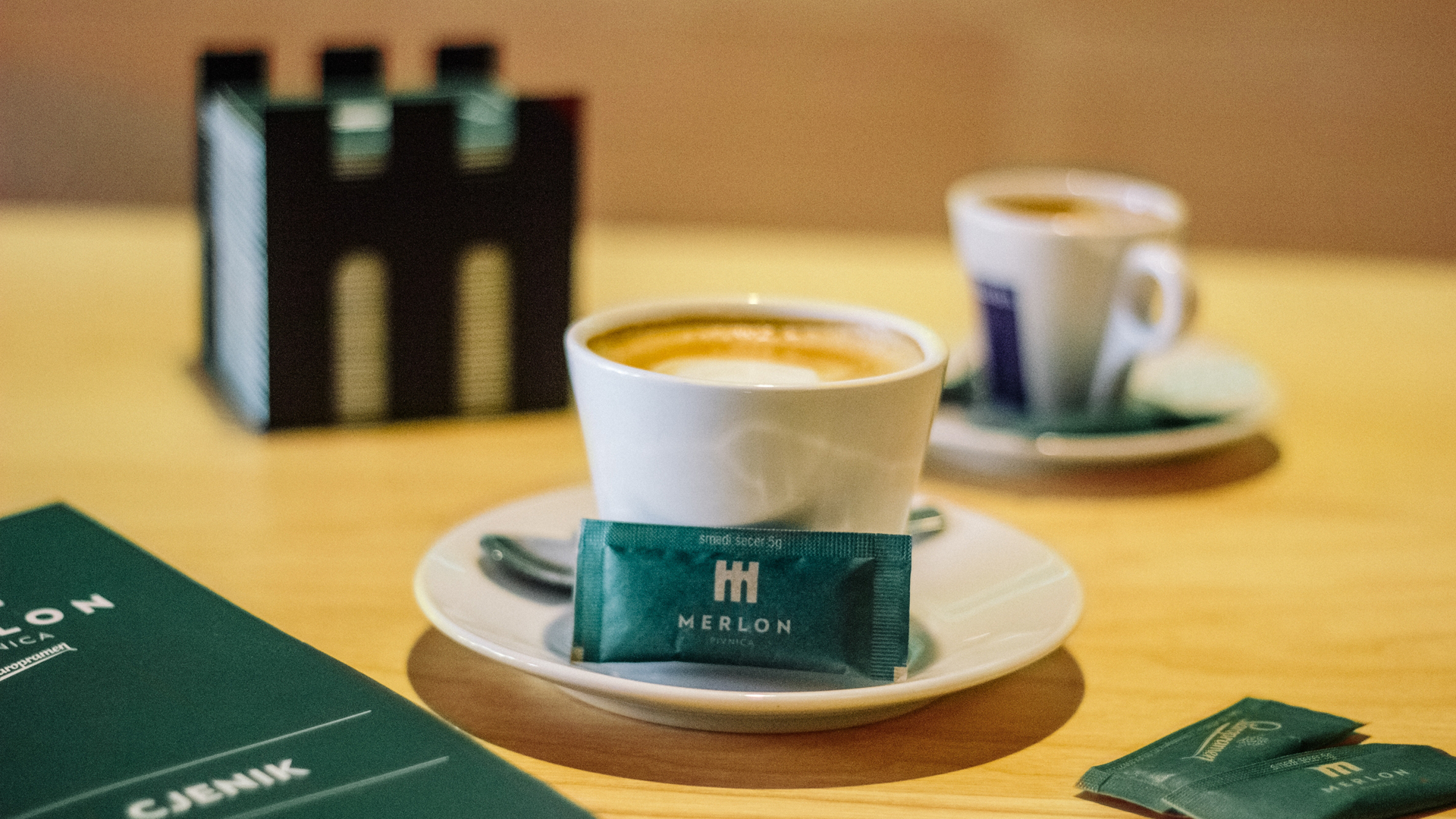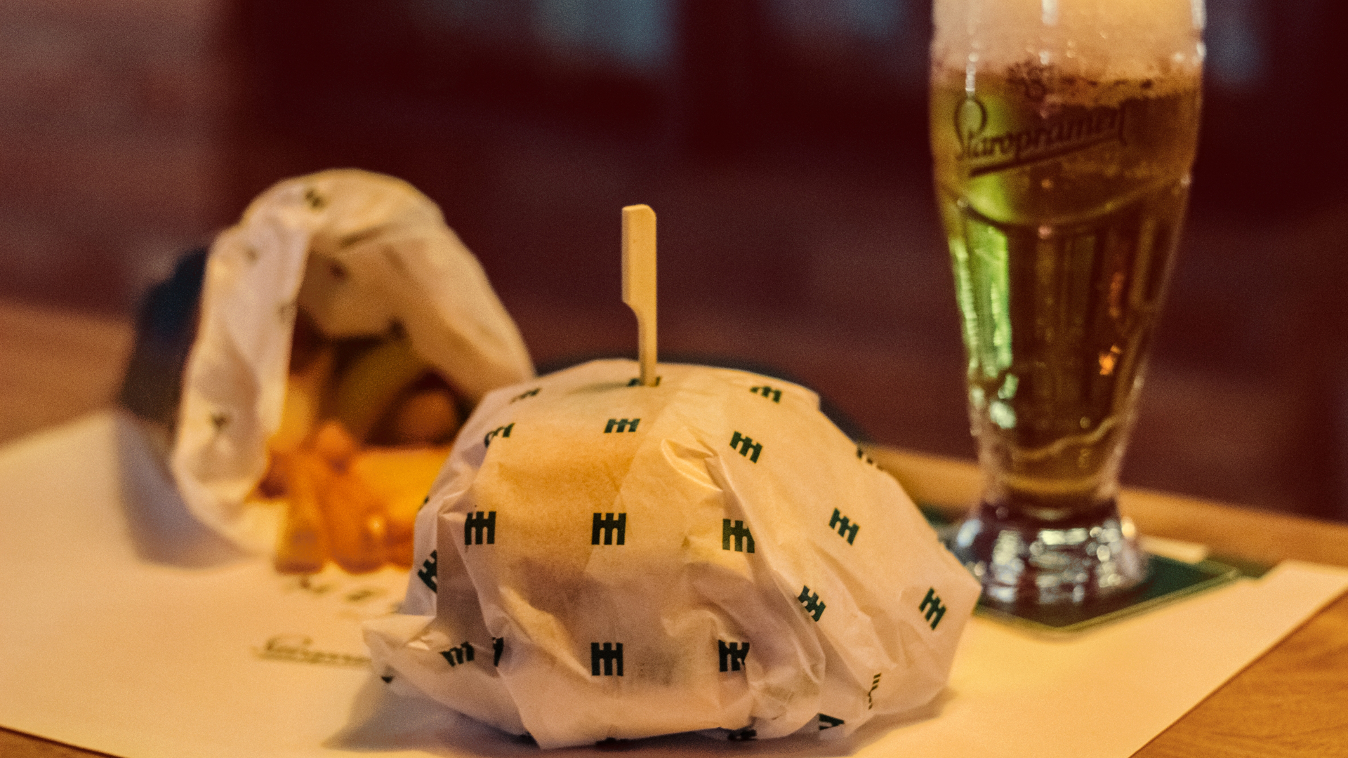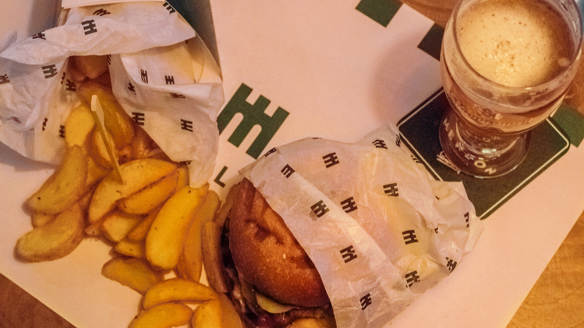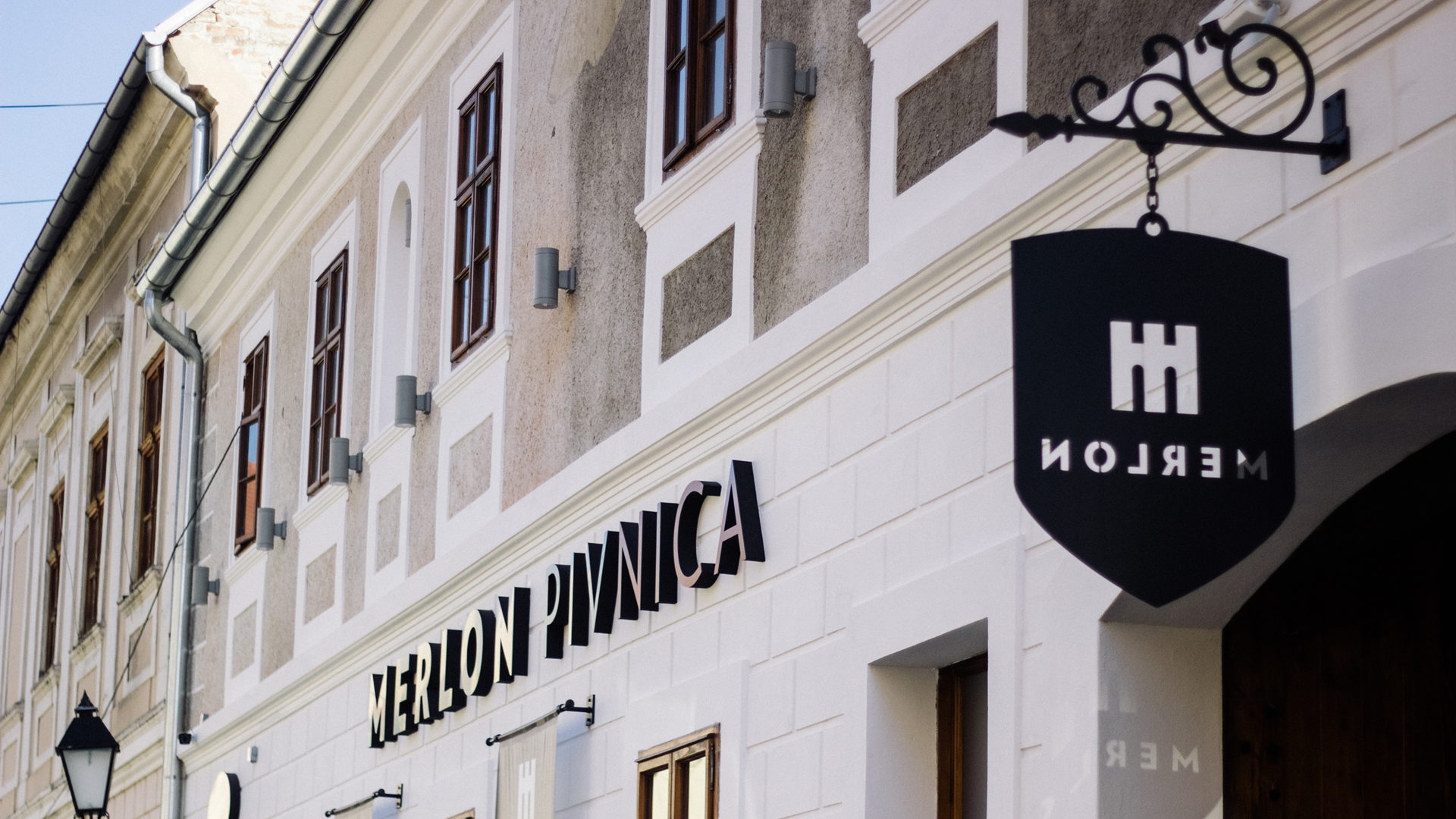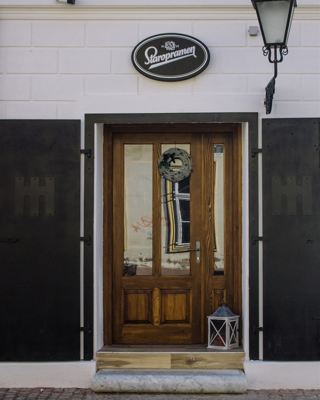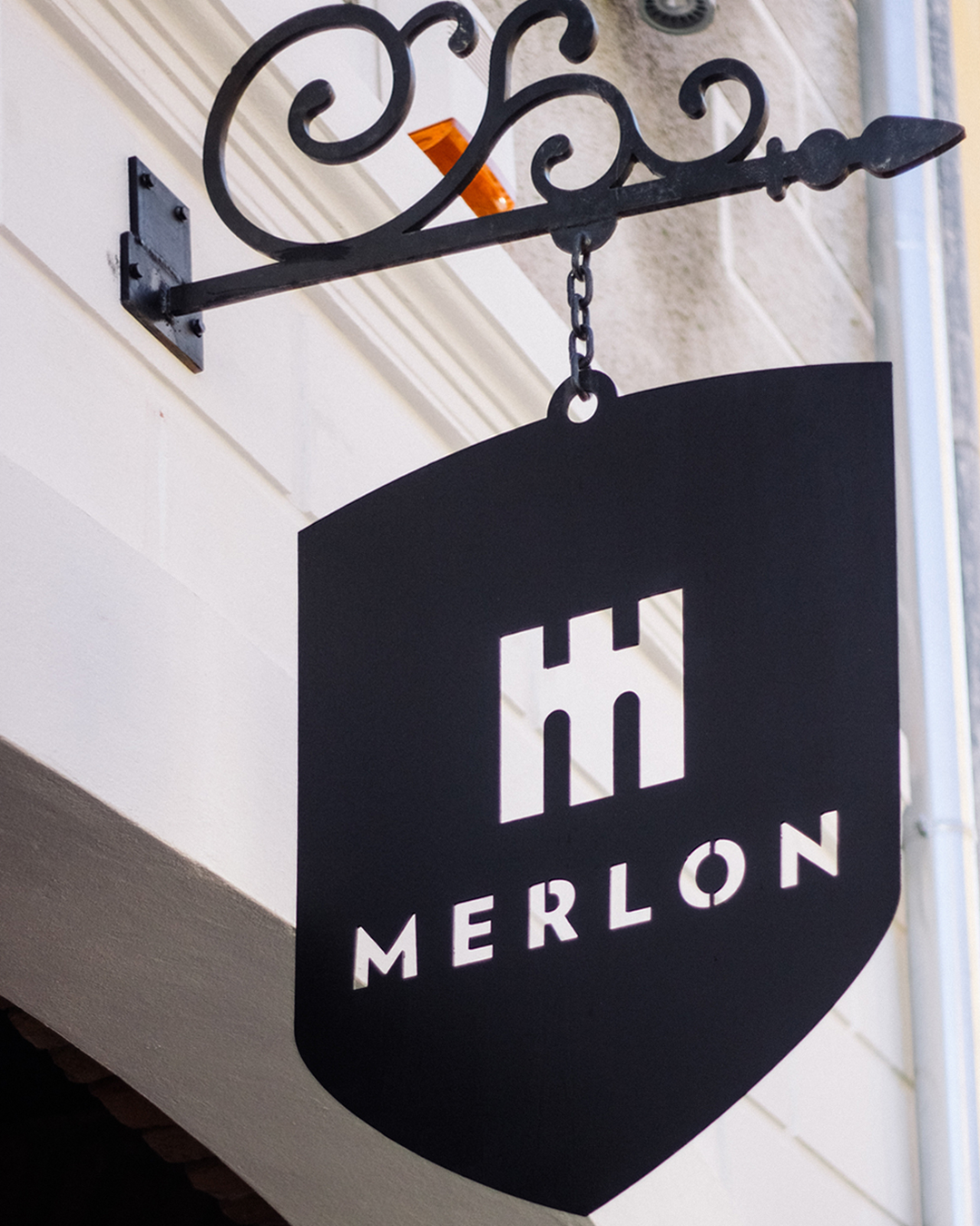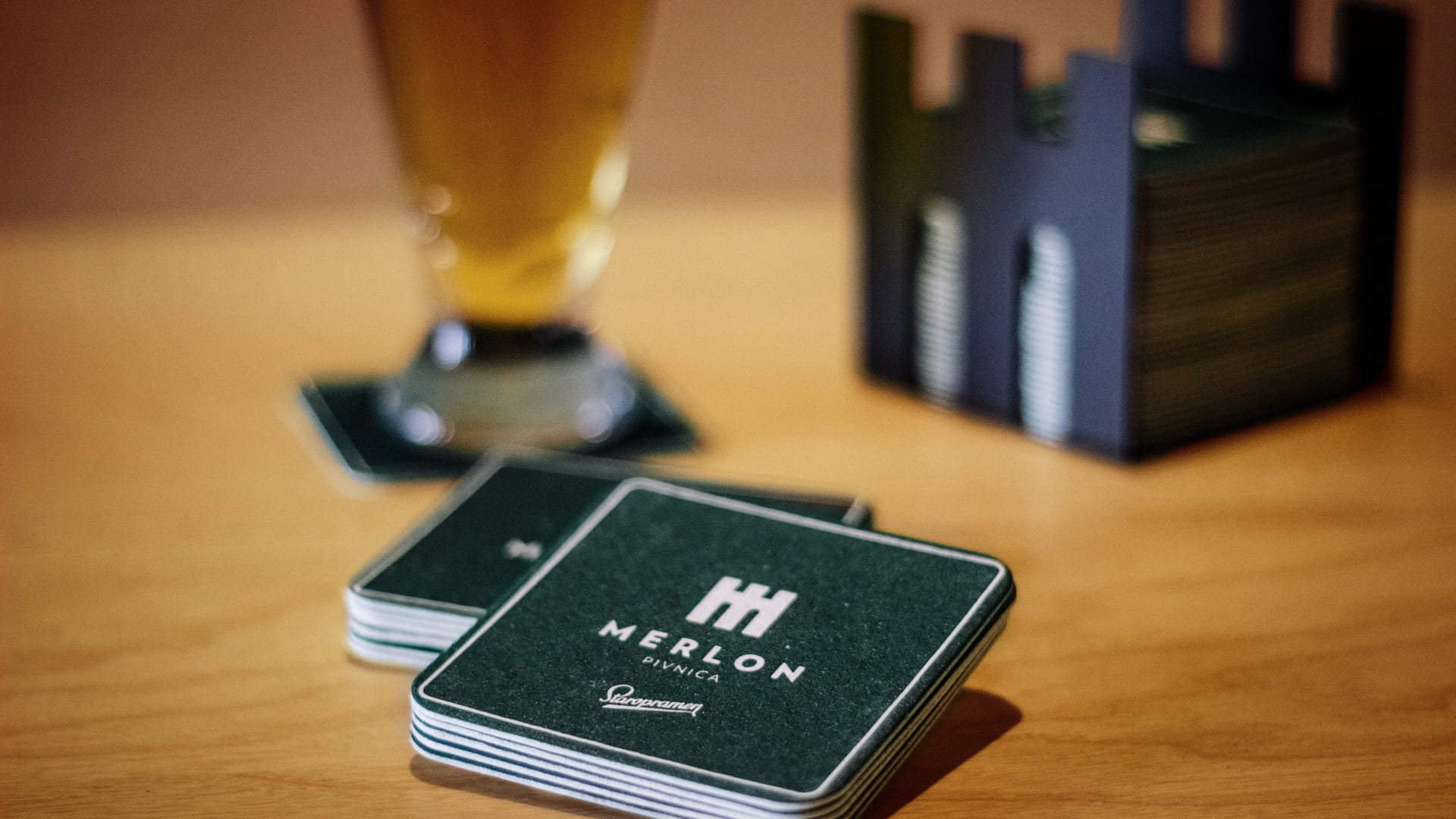
Merlon is a pub located in Tvrđa, the historic baroque centre of Osijek. Positioned within one of Croatia's best-preserved fortified urban complexes, the venue combines contemporary hospitality with the rich cultural and architectural heritage of the city.
The project involved developing a name and visual identity for a new hospitality concept located in the heart of Tvrđa. The challenge was to create a distinctive brand rooted in the history and architecture of the area while avoiding generic pub naming conventions and visual clichés commonly found within the category.
The project began with the development of the brand name. In military architecture, a merlon is the solid upright section of a battlement designed to protect observers positioned on the fortification walls. Since Tvrđa itself originated as a fortified military settlement, the term provided an authentic and meaningful connection to the location.
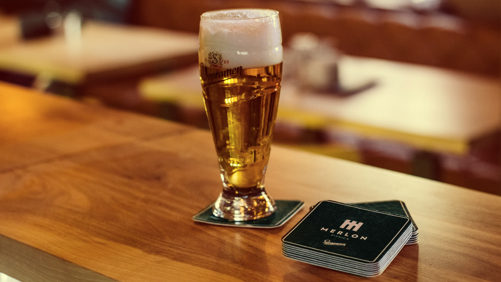
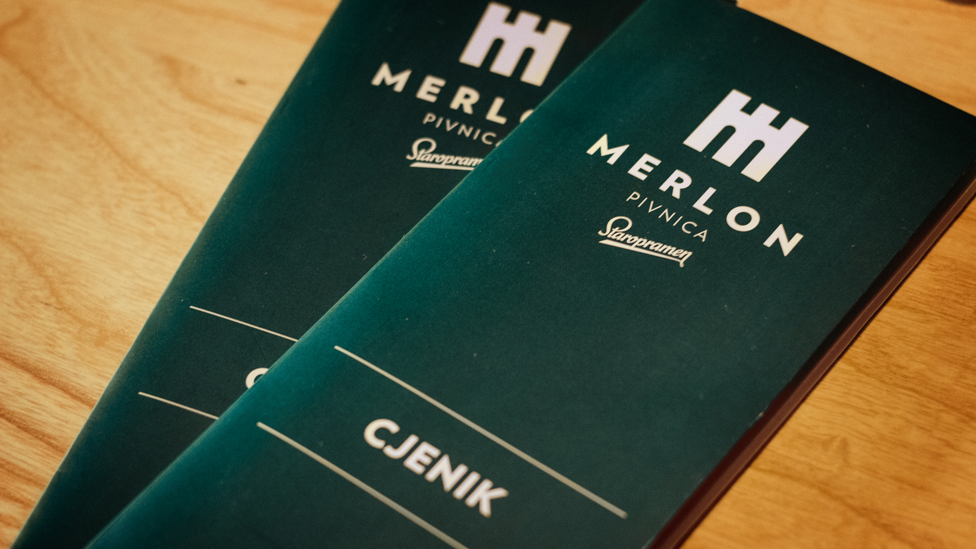
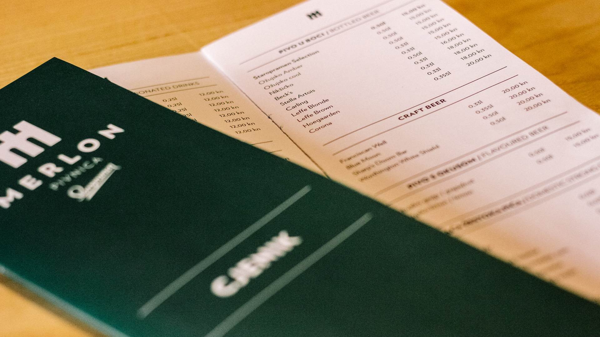
The visual identity translated this historical reference into a contemporary graphic language through simple geometric forms inspired by defensive architecture. Combined with a restrained visual system and the integration of Staropramen brand elements, the identity successfully positioned Merlon as a place where local heritage and modern hospitality meet.